What I learned launching my first product, part 1
Welcome! This post is part of a blog series about things that I’ve learned from releasing my first product as a bootstrapped startup founder. It’s been a massively educational process for me, and I want to share my learnings for the benefit of others and to document the journey for myself.
These posts are all about PicStory, which is an app that lets you make cool photo stories and share them with anybody. It has three goals:
-
to give you more creative freedom to create than Instgram or Google Photos,
-
to give you a simple and accessible interface to create stories, and finally
-
to make it easier to share them with friends and family by not locking your content into a walled garden where you have to have an account to view a story.
Check it out! And let me know what you think.
![]()
So, let’s dive into lesson one:
Lesson one: the way I see my product is not how others see it
The first and hardest lesson of launching is that I haven’t delivered fully on my “vision” for Pic Story, or at least not yet. I spent so much time during the development process staring at this the individual leaves on the trees that I completely lost the big picture view of the forest, and the end result is this:
What I’ve built doesn’t make sense to anybody except for me!
This became evident to me while watching my wife (my very first user!) interact with the app for the first time. I watched as she went through the signup flow, initially thrilled at the prospect of seeing someone really use the thing. And then as she clicked around, my spirits started to dwindle.
- “Why would you click that button now?”
- “Why did you click add photos? You haven’t even uploaded any photos yet!”
- “You’re just leaving that toggled on? Can’t you see that you’re supposed to toggle it on and off?”
Even still, I had tried intentionally to build the app out with that “first run” experience in mind1. I had at least some clue that I needed to focus on teaching users how to use the app right away, or else I’d lose them instantly. When you sign into the app, the first thing you see is this:
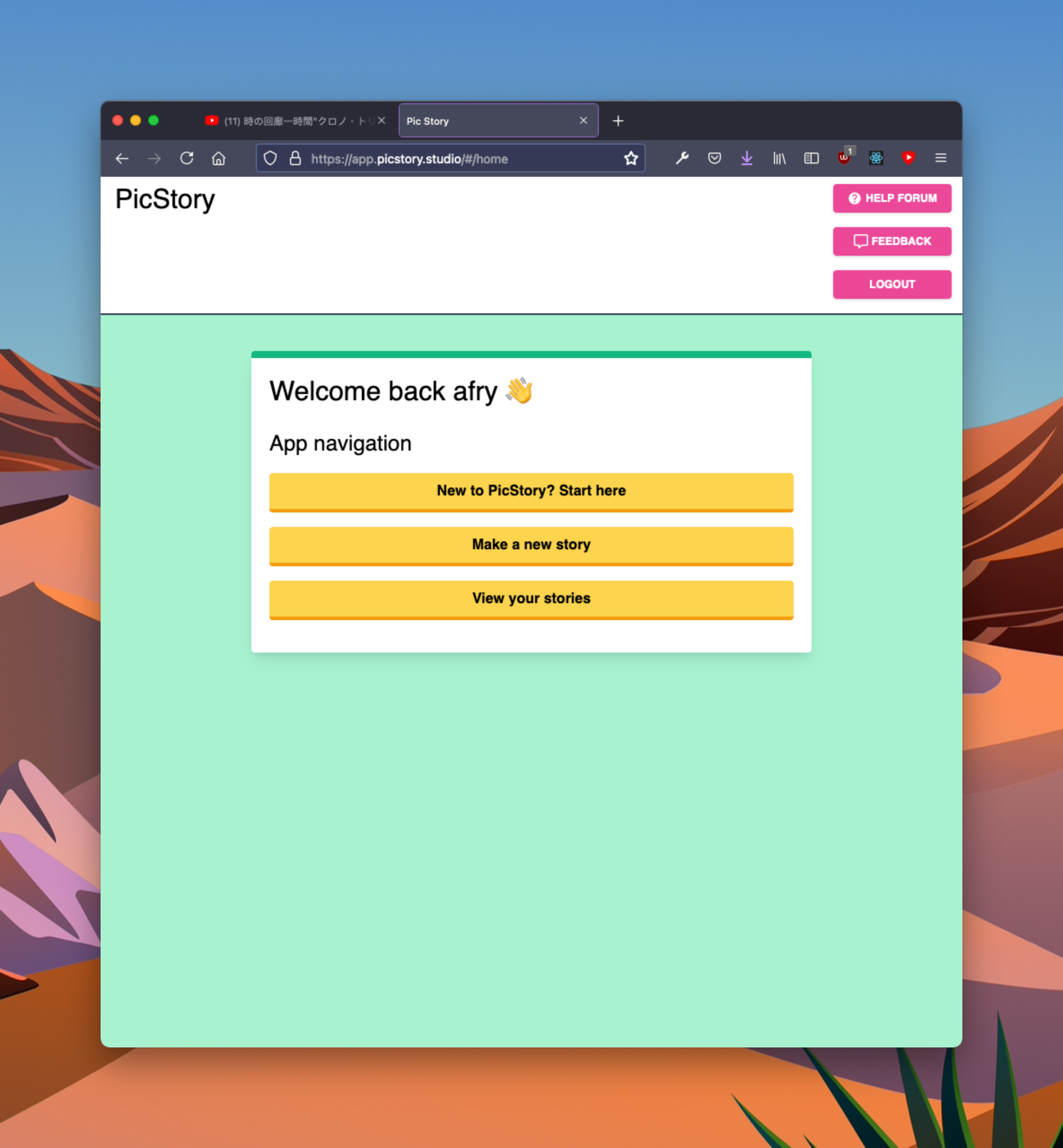
There it is, right at the top of the page: “New to PicStory? Start here.” This button takes you to a tutorial of the main features of the app. And even better, I built it using PicStory itself! This is a practice called dog fooding, and I was particularly proud of it. After all, if I can’t build a compelling visual guide to PicStory WITH PicStory itself, have I really built something that others will be able to use to make cool, compelling stories of their own?
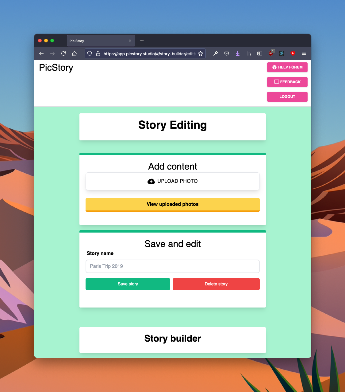
When you click that button, it takes you to the story editing UI itself:
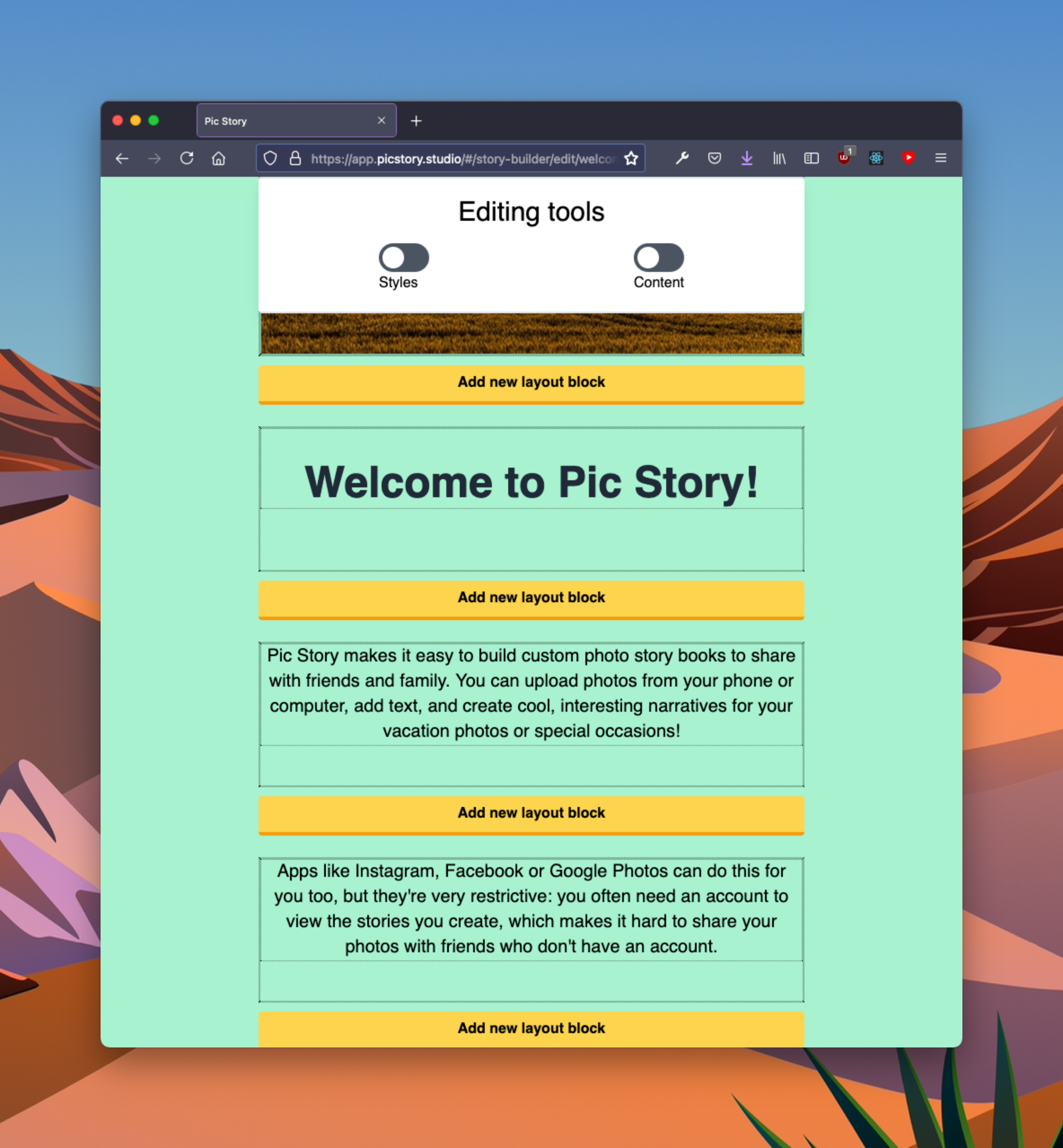
See the problem yet? I couldn’t either, until I actually saw other people using the app. NOBODY figured out that there is MORE content below bottom of the screen until I told them. You have to keep scrolling down to get to the meat of the tutorial:
I blame a little bit of this on modern web browsers. Once upon a time the vertical scrollbar was prominent and always visible, so you always knew if there was more content to see below the fold. But regardless, this is the world we live in, and I need to adapt the app accordingly if I want to avoid this problem.
So there’s lesson one: I’m arguably the worst person to validate whether any of the UX or design aspects of the app are going to make sense to anybody, because on day one I’m already too deep into the inner workings of the app to appreciate how it will impress itself upon the naive user. I have firsthand knowledge of how the whole thing operates: an intimacy of understanding nobody else will ever have. If I inadvertently build in any funkiness into the UI, then it might skip my notice entirely, but it won’t skip the notice of others!
My advice to you if you’re trying to figure out whether to launch or whether to hold back: launch now! It doesn’t need to be a hard launch, the product doesn’t even need to be finished. By launching in any capacity, you’ll gain so much insight into your product by watching people use it. You might never gain this perspective otherwise, and understanding how others will see it is and use it is vital to your success. It will go on to inform future iterations of the product, and you’ll feel better knowing that you’re playing with a fuller deck of cards.
So just launch! You’ll be glad you did 😊
Check out part 2 of this series for more lessons learned.
One last thing
Thanks for reading this! It’s a busy world, and it means a lot that you spent some of your your time and attention on what I’m doing.
Would you like to join my mailing list? I send out updates once a month, so you can stay informed on what’s going on, but not too informed 😊
-
Patrick McKenzie talks about this in his talk about Improving the First Run Experience. In short: if you don’t grab a user on their very first run-through with the app, then you’ve lost them. ↩